Sunday 30 November 2014

T.M. Digipak Mock-Up

    We have started our mock ups for our digipak design cover. We wanted to incorporate a screen grab directly from our shoot of Southbank  in order to create a link with our music video, as our music video is predominantly shot within this scene due to its urban environment and association with the younger generation. 
  • Our focal point to the front cover of the digipak is the 'Break My Fall' title font. Conventionally to dance music album covers; the title of the song is often the central feature, therefore we have conformed to this on the mock up. 
  • Furthermore the colour implemented in the title of the track relates to the powder paint event at the later stage of the narrative.  The colours in the title on this particular mock up are taken from a screen shot of when the paint had been thrown.  
  • The conceptual theme that runs throughout our video is colour.  There is a subliminal connection to the colours seen at the end of the video and the build up to the scenes, therefore the paint aspect on our album cover as well as our location are key features in our production. 
  • Finally the artists of the track are subtly placed at the bottom of our front cover, again conventional to the dance genre, due to its simplicity as well as its bold font.
  • Therefore due to these factors, this digipak  front cover is our favourite choice thus far. 


Thursday 27 November 2014

J.R. Contribution to Production 27/11/14

Over the past couple of days I have helped out in the production of our text bubble idea which we wanted to include in our narrative. I have used the computer programme Photoshop to help me create these text icons and then embedded them into premiere (for more information visit the text bubble preview edit post). Additionally I have contributed to a section of the editing process which can be seen also on the blog in the rough cut post. Furthermore I have also had some verbal input into the production of the digital pack production. This is due to the fact that tom wanted to experiment with the transparent layer and text effect in a different way using the stills I have gathered from our footage. These stills will be suitable for the majority of our digital pack production (album artwork/magazine article).

Screen shots and further editing details regarding the production of the text bubbles will be uploaded at a later date.

Group. First Minute Editied (Rough Cut)

This is a preview of our first minute of our music video. This is only a rough cut therefore this may change dramatically over the next couple of days. The majority of the footage we are seen using in this initial minute is the London footage, as in this initial part of the video we are building up our narrative, leading onto the paint fight positioned at the end of the video.


In this short edit a variety of different edits are included such as slow motions and jump cuts in order to create an illustrative interpretation to bothethe lyrics and mostly the beat of the song.

J.R. Test Shoot of Text Bubbles

Today we decided that creating a test edit of the text bubbles would allow us to identify any problems that we may encounter earlier on opposed to later on in the editing stages when we could be limited with time. Overall the outcome of this edit surprised all three of us turning out better than excepted, however there were still some faults in the text bubble designs that could be amended for our final production.

After creating a simple range of shapes on Photoshop and merging the layers together we decided on a suitable rounded font which would be clear and easy to read as an audience would have to be able to read these text bubbles in the given time that the shot is shown in our final production. Furthermore this will result in us having to plan our shoots in regards to positioning of them in the timeline within the premiere file, and the dimensions of the text bubbles in correlation to the shot. Additionally the text must be planned out to support the narrative we are trying to create in our music video. Another feature which we have noticed in this preview edit is the fact that the green bubble is shown to be aimed in the opposite direction to the phone, therefore when creating this text we must ensure that the templates for the speech bubbles work co-excitingly with the props (phone in most case).

Moreover, to save some time in the Photoshop side of this design we will create several templates which will allow us to stick to a certain set of dimensions for the text bubbles and additionally using the colour code on the colour pallet we are able to ensure that there will be no colour difference in the variety of text bubbles.


Wednesday 26 November 2014

H.C. Progress and mock ups lesson 26/11/2014

I spent today's lesson collecting the typefaces we plan to use in future on our print products, and then created four mock up ideas, mainly focusing on the text layout and the type of image that we will use for our background:


This is the initial idea I came up with, aiming for an illustrative style of cover - in this case a man breaking his fall into icy water. Tom and I came up with this first idea to break away from our colour theme in the narrative, to make sure there was also an extra visual link with our track. We are not likely to pursue this idea however, as the man in this photo is not young, so does not fit with the visuals conveyed in our track and with the genre and the positioning of the lettering looks clunky and too dominant on the page.
 
 
2.


For this second design, I have reverted to keeping with the idea of paint and bright colour, whilst maintaining a simple typeface. By positioning the type in the centre of the page and the name of the artists at the bottom of the image, I have created good spacing which breaks up the page into thirds well. The contrast between the colour and simple white typeface is effective in placing this ad in the dance genre.


3.
 

This design is an example of what we could produce for a two page spread. I have placed the type in the top and bottom thirds of the frame between the main colour source of the image, with the track title 'Break my fall' placed in generally black background. This adheres to the reading path around the page, with the eyes landing on the solitary title first and then being attracted to the colour below. By placing the title of the track on its own, this also singles it out as the most important part of the image and offers the information consumers will want.


4.


In this final design I inverted the text to make each word read down the page. This gives an alternative visual style and elongates the image, making it stand out more on the page. I think the simplicity of the font against the colourful background also conforms to the style of our genre. If I were to develop this design going forward, I would crop the image to fit an A4 page and stack each new word one line down, to create a trickling effect down the page, enhancing the final visual.


Manipulating image:

I created each of these designs using photos from google search and then placing text over the top in photoshop by using basic text tools. I enhanced the text to subtly lift it off the page and stand out against the colours in the background by using a 'stroke'. The images below show the process I used in premiere, selecting 'stroke' from the 'fx' menu, giving a light shadow underneath the text.


T.M. Progress Update 25/11/14

  • Today my main focus was beginning the editing to our rough cut of our music production on Adobe Premier Software.
  • Due to issues with finding the files containing our footage; all our clips were located on project.
  • Therefore our footage had to be dragged onto the visual timeline from the footage found in project.
  • The initial task when our opening footage was placed onto the timeline was to cut the ambient sound in audio from our clips in order to start placing the visuals with our track.
  • When the audio from our footage was deleted, I began to cut our clips and place them in the correct part of the timeline relevant to the beat of the track to present an illustrative relationship. 
  • For one of our shots; I experimented with a time stretch reducing it to 50% which connoted slowness at the beginning of the day that interlinked with the rising sun that comes just before.   


Tuesday 25 November 2014

J.R. Progress in Print Design Work

Progression in Print Work

After constructing an inital range of designs regarding the mixmag magazine design work i reflected back to the group, discussing how we could implement any of these ideas into the album artwork. An idea still favored by all of us is the paint in water technique which expands upon our powdered paint idea found in our concept. Therefore after some development of the inital idea we came up with this inital design regarding the album front panel design.


For the majority of our design work we plan on using Photoshop as the final outcome will be more accurate, smooth and overall bring about a more professional feel to the designs. 
 
To create this effect on Photoshop I used the fx effect to enable me to produce a more transparent effect to our text, as it will work well with erased image placed as a top layer. Additionally I have used a second image to create this 'image text' effect showing the image through the text. this is something that we have previously thought about creating due to this effect being found in existing album artwork like 'majestic casual' who conform to the same genre of music as our track does.


The picture above is the initial edit testing this 'image text' effect.
 

H.C. Progress update 25/11/2014

During the course of the lesson today and extra time after I have completed the following tasks:

  • During the lesson period - completed initial research of secondary magazine placement 'EDM Magazine' and uploaded post. Completed preliminary check of the blog, for any outstanding posts.
  • After the lesson - Continued editing process on our main production piece, aiming to cut the clips to significant beats in the song and select our best shots working towards the rough cut deadline at the end of the week. 
  • Finding different typefaces for possible use in our digipak in order to give our track a prominent visual appearance.

H.C. Possible typefaces

For our track's print products we would like to use a modern or futuristic typeface, as is common in the genre. Below are some examples of possible designs we may decide to use:


By using this style of typeface, we will be able to create a recognisable product within our genre as the dance genre tends to use basic and bold designs, which we found during our digipak analysis task. By emulating the same style we will create a product that our target market can visually associate with other products within the genre whilst avoiding directly copying as there is subtle diversity between each typeface, as can be seen above.

H.C. Further print research: EDM Magazine

After discussion in our group we decided to abandon the idea of using the online platform 'Maxumi' and use a more traditional style. After research I found 'EDM Magazine'. Although as the name suggests EDM has a strong focus on electronic music, however also branches out into house and dance music, giving us a solid ground to work from.

  • EDM has a bi monthly publish which means there will be good exposure to our target audience.
  • The magazine also has several other subsidiary events such as festivals and club nights, which could be used for publishing our advertisement.
  • The magazine also has social media platforms and links to its website which provide exclusive content for readers, making this a hugely popular fold from which to launch our advertising campaign.

Monday 24 November 2014

Group. Objective for the week

Due to delays regarding technical issues revolved around not being able to locate the files of our footage, we have finally started our editing this week (24th November).
Therefore our main objectives for the week will predominantly be the development of our production on the editing timeline.
However we will also be focusing on digipak research, and developing some initial ideas for the four panels. As well as working on the advancement of the advertisements for our chosen magazine 'Mixmag'.  

Sunday 23 November 2014

J.R. Initial Designs Mixmag Magazine

Initial Designs Mixmag Magazine

After looking into the adverts found within the mixmag magazine, i have produced a variety of different inital designs which should indicate the direction i want to go down when designing this advertisement page.

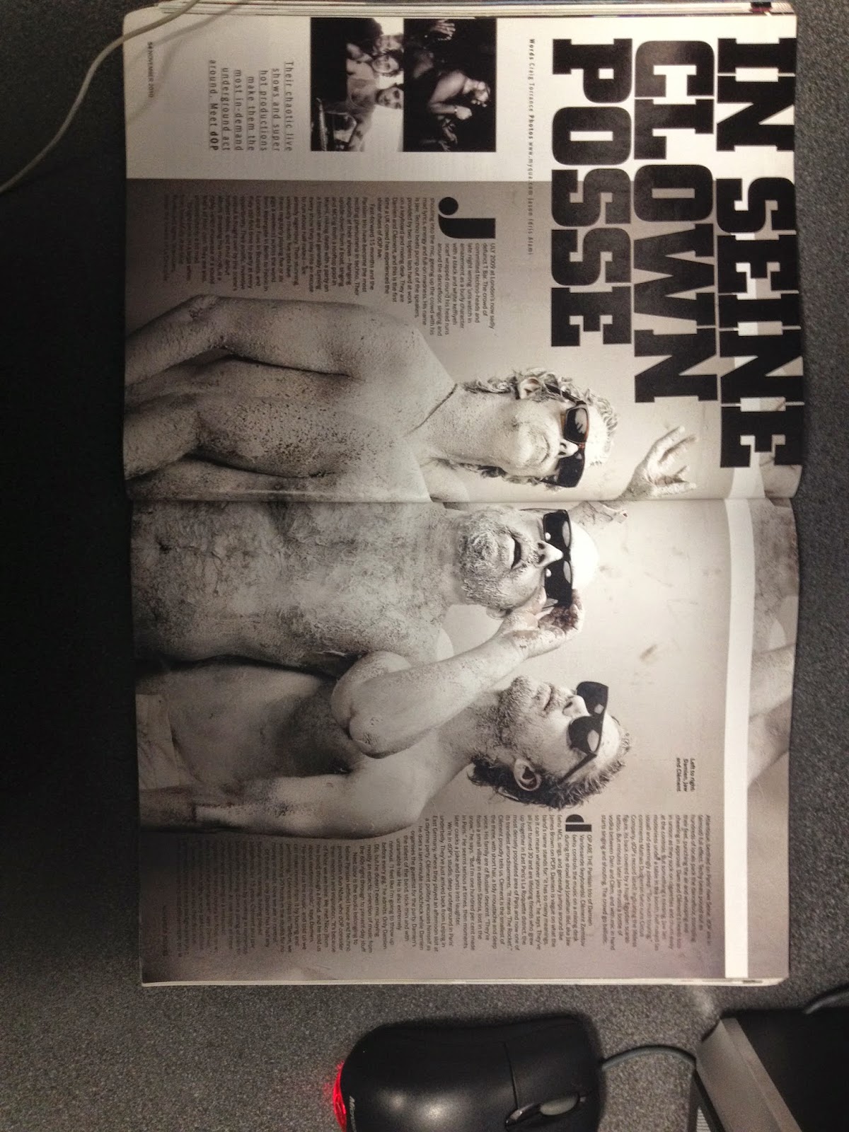
Firstly i generated some simple magazine cover ideas which were to be based upon the design and layout of the magazine, although not the task in hand, these designs allowed me to identify the common features found within the magazines and how i could integrated these common aspects into my own design work, ensuring that it is also relateable to the track being promoted.


Design 1&2

Design 3&4


As seen in the pictures above the designs that i have temporarily produced illustrate the way in which colour is a dominant aspect of the design found in this magazine, therefore i have made the link with our concept implanting our powdered paint into the colorful design scheme. Furthermore a dominant message is also produced through the way in which the text is designed and how it is positioned in the page. I have therefore experimented with this shown in the 4th design where i have rotated the challenging the normal horizontal design that most article conform to. 

Design 1

Design 2

Design 3

Therefore after these first designs i then moved on to transform the conventions of this magazine i have previously looked into a apply them to a magazine article. The main difference is the fact that the relevant information are shown on these designs opposed to the first designs. By this i mean the only dominant message that needs to be portrayed in this advertisement page is the name of the track and the producers, in comparison to this and the magazine title itself. Shown in design one is an idea that i am particularly fond of, as it is quite a unique design which could be incorporated into our concept. The paint entering water can be related to our powdered paint idea, which could be further developed into the representing youth in a positive light. This may be produced through the inclusion of imagery a common aspect in these 'one off' advertisement pages. 

Therefore in design two i expanded upon this idea of using faces of young people covered in powdered paint, these images could be taken from our original footage gathered. In this design i have shown the 'text boxes' to spill into the image above, this is a design feature which i would be highly recommending for us to incorporated into our designs if we include a large number of imagery.

Finally in design 3 i have started to experiment in the way in which the text is displayed on the page, as relevant information like the release date and maybe some background information about the band will have to be shown in this advert therefore creating a variety of different shapes to shown this information will make the advert more interesting to read. Furthermore by adding dots and lines (although not shown in this design) a sense of texture will be created in the advert allow them to become more eye catching subsequently giving out the message in the advert more successfully.

Overall i believe that as our track is produced by a relatively low profile producer, it will be hard for us as a group to design an advert which incorporates their profiles into our work. Yet this allows us to really be experimental with our design work, and has allowed us to make interesting links with our original music video concept. This is something that has already been shown above.     

Thursday 20 November 2014

Group. Reflection of Shoot


J.R. Mixmag Magazine Research


After looking into existing music video magazines we as a group established that the mixmag magazine would be a ideal choice as it conforms to all the conventions which our found in the track which we are working with. Furthermore this magazine is dominantly based upon the Dance genre within the music industry, therefore using this specific media platform to advertise our track is the most ideal way to gather attention.


Through looking into existing music video advertisement pages we see that the common features employed into the design of the advertisements are usually bright and vibrant colours with a strong use of typography to reinforce the bands image or general promotion. Additionally this music magazine is predominately aimed at a younger audience meaning that they must apply to what the consumer wants to see. Therefore a higher level of imagery is used in comparison to the amount of written text included I the magazine, generally if the consumer wants to read more about the article/advertisement they can do so by following a link onto the mixmag website which consists of the whole article. Furthermore the text used in these advertisements must be simple and consists allow the consumer to sustain interest in the advertisement.
 
When observing the general layout of these advertisements we see tat  a white background is used as the base colour for the page, therefore black text is used with the imagery of the advertisement placed on top of this white back ground. Even if text is found to be placed over an image generally a white box will be created (like a text box) to allow consumers to be able to easily read the information being displayed. Expanding on the layout I must comment on the way in which the magazine layout has a variety of different setups, varying from a double page spread to a small advertisement taking up a third of an A4 page. As far as shape is concerned a variety of different shapes can be used to add a sense of texture to the advertisements, meaning they will be more interesting to the eye, opposed to sticking to a basic rectangular/square set out.   

Tuesday 18 November 2014

H.C. Research into possible advertisement platforms

Maxumi Magazine:

  • Maxumi is an online music magazine based in Brighton England that focuses generally on the dance/ house and drum and bass scene.
  • "We take pride in the quality of the content, aiming to be a little more sophisticated then (than) other publishings, whilst keeping the tongue firmly in cheek." - From Maxumi.co.uk.
  • "Maxumi also seeks to push forward the talented underground scene, and works with several high profile pr agencies to publish exclusive reviews, feature’s and more."
  • Given the ethos and target market of the magazine, this platform would be suitable to advertise our track from, allowing it to stand out against the mass of material within this genre.
  • The fact that Maxumi is also a digital based media is a strategic advantage for advertisement, as the dance genre is dominated by online download charts and other associated advertisement methods available through the interactivity of web 2.0 such as cookies.

Monday 17 November 2014

Group. Band image - print

 Initial ideas for print:
  • Our didgipak and associated advertisements require us to follow conventions of our genre and narrative of our video.
  • We will include young people in the images for the prints with consideration between a group shot and using our main protagonists Jack and Tom.
  • We will also consider absence for our image, using instead just the title of our track.
  • Our initial concept is to make a link between our video and our image is to use the powdered paint as a visual motif. Our hope is that this will be bright and eye catching and the colours will stand as a visual representation for the vibrance of youth.
  • Because of the genre of our track, our print advertisement will need to be targeted specifically at magazines that represent that genre. We have identified 'Mixmag' and 'Maxumi' as our intended platforms for advertisement. We will use these as a strategic medias for advertising our print as we will be able to access our audience best through this.

Wednesday 12 November 2014

Group. Animatic


  1. We divided our animatic up into 3 parts (beginning, middle and end of our narrative) so Jack, Harry and I could all simultaneously work on the task at different computers in order to speed the process up.
  2. The animatic has helped us develop our concept in numerous ways. For example regarding camera work; although our narrative involves predominantly handi cams, we need a lot of movement and various angles. Editing; the animatic has shown the various after effects we plan of using, for instance the text message bubbles as well as the static fuzz.
  3. The animatic has also developed our process as during the task we were able to acknowledge what particular shots we were missing, therefore we were able to implement these on our animatic before we went on our shoot.
  4. This task differed from our animatic during AS because we were more understanding on how useful and necessary the animatic was for the development of our production.
  5. The challenges we faced involved exporting each of our parts onto the same computer. Mainly due to the problems I had from saving the images onto my memory stick therefore when it came to exporting I had to save the images to the data disk first, this was very time consuming.   

Group. Plan of action for shoot 12/11/2014

Today we are going to carry out the shoot for the paint fight sequence at the end of our narrative. Below is the completed call sheet, with shot list and the risk assessment attached.


We will take a large volume of shots at varying angles and distances, as well as handi cam shots to give a first hand impression of the action. Tom and Jack will remain as the organisers of the event and main characters in our narrative. I (Harry) will be filming the action today and giving direction to achieve all the shots we have outlined. 

Group. Shooting Scheudule

Second & Third Media Shoot

After completing our initial shoot in London we have realised that we will need to re-shoot as we believe that the footage we have gathered was not as good as it could be. A main feature which we identified that we needed to improve was our plan of action for the day of our shoot, although we had some shot ideas that we wanted to create in our production it was nowhere near as many as we should have to achieve a high grade in our production. Therefore we returned to our initial research stages of our production looking again at the technical analysis, as through this we could recognise certain shots which work well in coexistence with each other. Furthermore this will help our main cameraman Harry in the direction stages of our production, as we will have a more detailed plan of action for our shoot.

The main characteristic that was lacking from this initial shoot was as follows;
  • Camera movement
  • Close ups
  • Variety of different angles
  • Dolly Shots
  • Handicam
  • And shots with the Cam frame
Realising that we didn't gain the best footage from our initial shoot up London we took this as a learning curve, and were able to plan for our powdered paint shoot more effectively. Once again camera movement was a key feature which we had identified as being a significant factor in our production, to relate to the upbeat style of our chosen track. Additionally we have created a sheet of visual imagery which we could use when shooting which would act as a visual aid in the direction of this sequence in our media production.


Date of shoots;
 
Paint Fight - Wednesday 12th November 2014
 
London Shoot 2 - Friday 14th November 2014

Thursday 6 November 2014

J.R. Contribution to Shoot

MY CONTRIBUTION

For our first shoot up in London, I have made the following contributions;
  • Recording a list of shots that we needed to gain from our research
  • Producing the poster prop we are using to anchor our concept
  • Applying some camera input to harry the dominant cameraman in our shoot
  • As our concept involved two youth characters myself and tom became the narrative's, therefore we were acting in this London shoot.
As far as direction and camera work is concerned I haven't had a large amount on input. This is mainly due to the fact that I will be completing a large amount of the editing within our music video production.

List of shots I made the night before the shoot. I made this on my phone that we were easily able to refer to it throughout the whole day.


Wednesday 5 November 2014

J.R. Deconstructing Print Texts

DIGITAL PACKS ANALYSIS
CHOOSEN ARTIST: SKREAM
CHOOSEN ALBUM: SKREAM!


Genre

Initially it can be seen that this album cover conforms to the genre of music through the mise-en scene used. Clothing especially allows us to identify that this digital pack is representing the ‘dance’ genre, due to the youthful representation that is held within this genre being presented through the clothing. Additionally we see that genre is generated through typical features which demonstrate the conventions of this genre, for example the typography used on the cover is bold and vibrant. Furthermore the text itself is also in itself an iconic symbol in connoting the genre of the album, as opposed to a text like ‘Gothic’ which would conform to more negative style of music e.g. heavy metal, the text on this album cover is more smooth and free flowing. Another significant factor which points the album towards fulfilling the genre of dance is the location shown in the album cover. This location seems to be a typical house party setting where the dominant music played is either dance/electronic, therefore representing this album to be in conformity to either one of these genres.

Media Language
  • In this album cover scream is positioned slightly right in the image, yet is looking directly at the camera. This produces the idea that he is looking directly at the consumer, making him the central point within this digital pack. His dominance is also shown through the white shirt he is presented as wearing which clashes against the darker background. In terms of colour this enhances the dominance that he has amongst others positioned in this still. A very slight yellow/orange colour wash is placed over the top of the cover, creating this warm sensation which is closely associated with this genre of music.
  • As shown in the image Skream is shown making no contact with others around him creating this sense of isolation and his direct contact with the camera challenging the rule of that forth wall. Although this creates a rather dominant impact on his presence in this album cover, his non-verbal language shown in this image presents him as being, normal with no sudden importance. This is mainly presented through the slouched stance he is seen with.
  • The self-named title of Skream really represents the artist as it shows he is the only point of importance in this album. As this is the artist’s first album we see that he is more than anything trying to promote himself in the music industry. Therefore by not using any emotive language and quotations, connotes his new individuality within this dance genre.
  • As this is quite a plain album cover, there is no real signs of intertextuality, this could be due to the fact that this is the artists first album meaning at this moment in time he didn’t have much of an image to present, furthermore meaning that intertextuality (if any) would be limited.
Representation

Skream is represented as dominant in this album cover; his clothing represents him as being modern and upbeat conforming to the genre of the album.  His dominance could also be shown through the large text which is presented in the centre of this album cover. His placement in the location of a house party however, creates the idea that he has made his way up from a small artist, this relates to Dyers paradox of being  simultaneous ordinary and extraordinary. Moreover, adding to Skream's star persona. 

Institution and Audience
The main purpose for this album cover is to promote the artist on a wide variety of media platforms. Hard copies of this album can be found in various stores like HMV for example. His album was released with Tempa Labels, which is a small record label stationed in east London and run by ammunition promotions. Although this is a preferably small productions company, as it is stationed in London it is able to vertically integrate with surrounding companies, consequentially raising its publicity in the music industry. Through the increase in new media technology and the rise in Skream's image, his album can be found on various different online sites, like iTunes and YouTube amongst many more.

Back of Album 

The most recognizable feature shown in the back of this Album has to be the way in which the bright vibrant colour creates this sense of power and dominance with the artists image. All the text is centered opposed to being listed down the left hand side of this panel meaning that the whole layout of this back cover is more targeted at producing a status for the artists rather than just displaying the relevant information. Furthermore we see that the text is all presented in italic which creates this more unique style to his album, making him more iconic in this specific music industry. Furthermore in small print below the names of the tracks found in this album we see reference to the record label which was used to produce this album, yet it also is center meaning that it does not deter from the layout and style of this album. Additionally we see that no imagery is used in this side of the album creating this idea of the artists being absent yet present in his own work, a paradox Dyer has explicitly said will aid in the success of a artists products in the music industry. 

Tuesday 4 November 2014

T.M. Deconstructing Print Texts

Genre

'Ready for your love' by Gorgon City is evidently a track within the dance music genre. This is because of the conventions of dance music shown in the digipak; for example vibrant and bright colours as well as block capital letters accompanied by a conceptual image. Furthermore there is a suggestion of a sunny location connoted by the palm tree's in the background, which is often featured in dance music videos.

Media Language

Bignell states that advertisements "endowed products with social significance so that they can function in our real social world as indexical signs connoting the buyer's good taste, fashion, trendiness or some other ideological valued quality." This idea is evident in this digipak as there is a unique conceptual image which could be considered a trend to consumers.
There is a paradigmatic relation with the palm trees due to its association with sunshine and beaches which are conventional to dance music videos.

Representation

Due to the artists name and the songs name only taking up a small section and not being  the predominant feature to the digipak, this adds to the artists meta-narrative as it suggests Gorgon City are reasonably modest due to their small font on the cover. Furthermore its bright colouring may attract customers and stand out to potential consumers.

Institution and audience 

The primary purpose of the text is to provide a platform for the audience to consume the artists content. This can be achieved in a number of ways; for example Gorgon City belong to the label Virgin EMI Records which is a subsidiary to the conglomerate Virgin. Therefore using horizontal and vertical integration the company can use its subsidiaries in order to sell the track.
Furthermore the song can be advertised as a teaser on adverts for related videos on youtube.
Finally the song can have hard copies in shops as well as be digitally downloaded on sites such as iTunes and Spotify.


H.C. Personal reflection on London shoot

My role on the London shoot was camera and direction. I achieved success in the following ways;

  • Following a plan of shots we created in our animatic.
  • Experimenting with different camera angles, heights, shot sizes and distances.
  • Trying where possible to adhere to the rule of thirds to create visual interesting and impressive shots. 
  • Shooting a wide variety of the content of our locations to portray vibrance and represent culture, as well as Jack and Tom interacting witht these features to try and show positive youth culture. 
  • Collecting a high number of relevant shots to give us a range of material to use in editing.
There were some difficulties and challenges in the day which may hinder our production;
  • On the day, lighting conditions were not ideal to match the summer vibe of our song as some cloud cover is evident adn dulls the shots. We are aiming to correct this using colour grading in after effects in the editing phase. 
  • We also had available the school's higher frame rate (50fps) camera, which in the end we did not use. I took the decision not to use it because of the fact that we had not planned shots in our London locations to use it, meaning to come up with these would have eaten into our time schedule, possibly jeopardising our completion of the shoot.
On the whole, I feel the shoot was positive and it has given me a creative boost to take forwards into the editing phase. 

H.C. Deconstructing print texts


Genre:
  • The genre of this track is expressed through the visual elements used in the album cover. The artist Calvin Harris is positioned in the foreground of the shot, which establishes genre as the dance/house style is dominated by solo acts like the DJ Harris. Furthermore, the shoot appears to be located in an American style suburb, which is a typical setting for hi fi dance track videos and so provides a direct link to the genre.
Media Language:
  • The artist Harris is positioned in the bottom of the right hand third of the frame on the main album cover. This draws the attention of the consumer, promoting Harris as the main focus of the image. The photo has been manipulated to enhance the slightly warmer colours such as the orange of the brickwork as well as casting a more yellow light on the concrete behind. This is typical of the genre, making the style iconic and accessible to the target audience. Extra props are absent from the image, reinforcing Harris as the most important focus in this photo.
  • The positioning of the artist Harris in the bottom third of the page leaves him at the end point of the reading path around the page. Furthermore, Harris adheres to the rule of the fourth wall, making no direct address to the camera capturing the still. This creates the paradox of presence and absence as recognised by Dyer. However, the positioning of the artist alone, whilst singling him out as the main focus, also connotes a sense of lonliness and isolation with the use of the fourth wall. This is exaggerated through body language, placing Harris low in the shot. The warmer colours enhanced by colour grading in the image are iconic of the dance genre, as previously mentioned, promoting a positive attitude as apposed to blues which would create a neative light.
  • This digipak does not incorporate any emotive language or quotations from the artist or other sources, only the artist's name and the title of the album. The title '18 MONTHS' has several connotations and is very thought provoking. Becasue there is no obvious link between the visuals and the title, it is left to the consumer to construct their own meaning of the title - could it mean the length it took to make the record? How long it has been since a previous relationship? This uncertainty leads to an incomplete star image, which fans of the artist will seek to try and complete by purchasing the record, therefore creating repeatability (Dyer). 
  • There is no obvious example of intertextuality in this particular album cover design. Postmodernism may have been demonstrated by the fact that there is no complete link between the visuals and the title of the album, in essence breaking the rules of conventional representation. 
Representation:
  • Calvin Harris has a very ordinary appearance in the cover for this album. His costume is made up of relatively lo fi pieces, a t-shirt, jeans and trainers, the kind of outfit that anybody could wear. This ordinariness is also affirmed by the location of the shot. Even though it appears to be abroad to the U.K. the setting of a suburban street is again a concept that everyday consumers are able to relate to. These techniques lead to creating Dyer's second paradox of simultanous ordinariness and extra-ordinariness, making Harris a star of the people.
Institution and Audience: 
  • The print text could be consumed in a whole variety of ways, as Harris' album is produced by Sony Music, which owns vast subsidiaries within the music industry. The primary purpose of this text is to provide a platform for the audience to access the artist, which also makes it a prime advertisement. Hard copies can be placed and distributed to Sony stores globally, with the digital image capable of being printed continuously for as many units as is necessary. In terms of viral marketing, this text could be placed on music download sites and services as a form for the target audience to recognise and consume, thanks to the presence of Calvin Harris in the image. 

Sunday 2 November 2014

T.M. Reflection of Shoot

  • On Thursday the 30th October, Harry, Jack and I traveled up to London for our first shoot of our music video.
  • We had a clear vision of what shots we intended to get and where we were going to shoot these due to our location reccie a few weeks previous. 
  • These locations consisted of Southbank, Bricklane and Camden. 
  • We were happy with the shots we captured, and  a lot were taken in order to keep our options open for when we get to the editing aspect of the production.  
  • However the only problem that we faced during our days filming was the weather wasn't ideal, because it was very overcast and grey but our track has a summer vibe which connotes sunshine and summer. This problem can be resolved through the use of colour grading during editing though. 


Harry filming from behind for a voyeuristic approach 

Shots of the protagonists traveling to different locations 


Establishing shot of the London Eye